
Monday, September 29, 2008

Tuesday, September 23, 2008
The Frame!
Part 1: Landscape Shoot


Part 2: Object Shoot


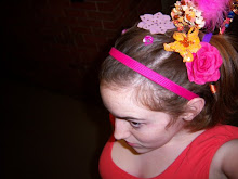
Part 3: My word


In the shoots above I was trying to be aware of the frame. In some shots my aim was to capture motion, and others light. It was fun studying locations and objects to analyze interesting angles and ways to photograph them. This was a fun project. And I was only supposed to choose two photos for each part, but I got a little carried away, so there are more! :)
Monday, September 15, 2008
Photo Restage


The photo above is my edited photo for this assignment.
I enjoyed applying the texture filter to this because the photograph looks more like a painting now. I also added the lens flare in the upper left corner because it creates a whimsical feel for the scene. I also create the illusion of a border because to me it looks like the scene is being observed by the viewer through a window.


I basically tried to re-stage the Anne Geddes photo from my previous post. I really enjoyed the lighting in the picture so I want to try and recapture that. The reflection on the vase really caught my attention. The texture of the flowers was also nice so I am including that in the shots. I really just wanted to re-create the whole concept, minus the baby. Although my cat did make an appearance in some of the shots, which was fun.
After taking the photos I was fairly happy with the results. I feel like I captures the texture and contrast like Geddes did. Unfortunately it was difficult for me to capture a direct focus approach. I love the the vase though, and the lines running horizontally across it. I am also happy with the elements of the photos and my favorite of the three photos is the one with the cant. I love the combination of the textured flowers, with the smooth , reflective vase and the curious cat.
Although there were many similarities between my photos and Geddes piece. I did enjoy experimenting with the composition. For example I love the wide open black space to the right of the subject in the first picture, contrasted with the color and busyness of the flowers in the vase, that just makes an exciting picture to me. I think what makes me love the original photo by Anne, and my pictures so much is probably the dark background with the bright textural foreground. Over all it was a fun assignment and I am fairly happy with the results.
Monday, September 8, 2008
Photo Critique

I really admire the work of Anne Geddes so I chose one of her pieces for critique. Of course I almost always enjoy the content in her pieces because they are usually cute and happy babies. She captures a lot of innocence and light that children seem to exude. I admire her creativity and ability to imagine children as part of nature and photograph them in ways you we don’t expect to see them.
In this particular picture I love the soft lighting, but the way she included the vase and marbles that highly reflect the light around the subject. The reflection of the light on the vase was a good manipulation of bounce lighting that caused more contrast so the baby stands out. Geddes also did a fantastic job manipulating texture. The dark background seems very flat, but the subject in the foreground features the baby wearing the flower hat. The hat inspires an organic feel and makes me think of holding flower pedals. It is a nice contrast to the smooth texture of the glass and marbles.
The composition is also nice and simple featuring the child as the subject in the foreground, but fallen down on the table to her right is a flower, that flower gives a nice twist to what could have been a boring almost symmetrical photo. It was really smart of Geddes to feature the one fallen flower to add interest for the viewer. The lovely colorful flowers full of texture really stand out from the grey background and brown table, again causing the subject to "pop".
The direct approach of the central focus is really nice. Geddes chose to capture the child from a frontal vantage point, where I think she was able to capture the innocence and curiosity of the baby in a simple manner. Between the elements of texture, lighting and the subject, it worked to her advantage to use such a direct approach for this piece.
Part of what makes this picture so captivating to me is the organic natural feel. Although geometric shapes obviously make a strong and interesting photo, I enjoy the warm and inviting feel of the natural shapes and lines in this piece. I feel like the simplicity of the natural shapes, and the curvy lines lead to the greater appreciation of the innocent subject. The photo features a natural subject we can all relate to in some way. Combining all the elements leads us to be able to understand the picture, and they invoke a reaction.
Filters and tweaks
This was our first photoshop , photo tweaking assignment:

I used the grayscale filter on this photo, I really like the way it turned out.
I think it has a classic but fun feel.

I used a water paper filter on this one that worked well.
I also intensified the red through out the picture some.
Ultimately it created a creepier "sublime" feel, which I like.

I greatly heightened the contrast in this which worked well.
I also added very faded fall leaves through the background for texture.
I think it looks okay.
Friday, September 5, 2008

Obviously this scene is a little creepy. I think the coloring and shading turned out perfectly on this piece. I love the perspective because it makes the viewer feel so small in comparison to the "huge" gate. I also love the angle and scary caution voltage sign on the gate door. It is just a different perspective and emotion I tried to explore when taking shots.

I love this picture for several reasons. I think the first reason I like it is because you don't initially realize that it is a stack of pipes. I love that there is a vanishing point created by the pipes. At first all of the white circles make the picture look like a flat pattern but then when you look closer you see the depth, and light at the end of the pipes on the other side. The small plant in the front also interests me because of the green contrast from the rest of the photo and its small size. I feel like there is even some symbolism here, like the pipes (representing man made industrialization) is towering over nature and diminishing the earth until like in this picture you can barely even find nature in your surroundings.

I wanted to include this photo in my blog because I love nature. I think the contrast between the green grass and bright yellow flower is beautiful. I also the like the placement of the flower in the shot. For one thing the placement effects the perspective and makes the flower look larger than it is in real life. I also think the off center upper left corner of the frame creates interest for the eye because it isn't a typical location to place a subject.
Subscribe to:
Posts (Atom)