Monday, December 8, 2008

Portfolio


Photography Portfolio Inventory:
By: Emilyann Allen
Email: emilyann.allen@sc.stephens.edu

Artist Statement:

I am a graphic design student at Stephens College. I enjoy many forms of art, from writing, to dancing, painting, singing, and beading. Any form of creativity is my playground because I am a child at heart and love life.


1. OnTheWall
2. 2.TheFace
3. Pink
4. FlowersandLines
5. Pipes
6. Nature (Manual Camera)
7. Fallen
8. Playful
9. PipesPhotocopy
10. Portrait
11. Beauty
12. Dark


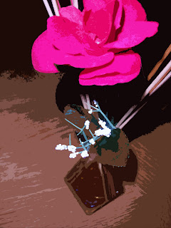
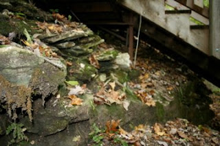
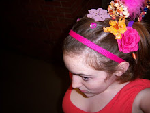
I have a range of photos in this portfolio that were shot over the course of this semester. I liked experimenting with repetition like in the piece titles “Pipes”. The photos are also meant to display a range of photographic ideas, from portraits and landscapes to still objects.


Friday, December 5, 2008

Final Project Self-Critique

Dancing: Self-Critique
Final Project

Developing the idea and plan for the “Dancing” project was interesting. I knew that I am passionate about dance and would enjoy basing my project on that theme, but I couldn’t decide how to approach conveying the fun of dance. I knew I didn’t want to just produce a series of regular posed dancer portraits, but I wanted the photos to draw a viewer in and feel the movement. After shooting the photos I decided creating a stop animation would be fun. I think the stop animation accomplished my goal of representing movement, so I was pretty happy about that. I do wish that I could have figured out how to make the animation run faster, because as it is on the blog, you can’t understand how it is really meant to look.

Final Project Research

Dancing: research
Digital Photography Final Project


When brainstorming ideas for my final project, I though it would be fun to focus on dance as a theme. When scanning through online studios and library books, I noticed that most dance photography is very posed and staged. This was annoying because I wanted to create photographs that depict the true fun, and emotion dance conveys. So when looking through dance photography books in the library, it was hard to find photographs that modeled my artistic goal. But I did find a book called Dancers by Anthony Crickmay, featuring a photo (of dancer Karen Kain) I felt like I could base my pieces on. The photo is of a ballet dancer, doing an arabesque. I like this piece partly because of the difficult pose, but mostly because of the passion yet elegance the dancer conveys. I compare this photo to my final series (flipbook, and animation) for a couple of reasons. One reason is obviously subject matter. But another reason is the pose of the dancer. Although my project depicts the actual movement of the dancer, the final pose is similar (both involving some leg extension). Many of my photos also take a direct approach in capturing the image and are also similar in composition to the photograph of Karen Kain. I am happy though to have broken away from the traditional studio posed dance photographs often produced. My photos accomplish a fun atmosphere and connection to the mood of the dancer that I feel is often lost in dance portraits.

Monday, December 1, 2008

Dancing

I decided after shooting my final photos that it would be fun to create an animation, so here it is:

Friday, November 21, 2008

Final Project

Emilyann Allen
Proposal
Final Project Proposal

I want to do a project based on theme and subject matter, and depending on the result of the images I may want to create a slide show or possibly a collage. I would like for the subject to be my little cousin that is a dancer. Through the images I capture I want to convey movement, light, and possibly create a whimsical feel. Or potentially an intense emotional feel. I danced growing up, and to me dance was very expressionistic. Dancing is a beautiful way to convey sadness or anger or hope. To dance in itself is such a freedom. It is my goal to create images that ignite passion in even people who have never danced, to truly convey its meaning.
I plan to start creating my vision by first portraying the subject. I want to take different shots of her in different costumes, and possibly even regular warm up clothes that create different moods. I also plan on finding different locations and settings to put her in, like the studio. But I might also have her dancing outside, connecting to nature. Or she could be alone in her house, thinking no one is watching, dancing wildly just for the fun of it. I also plan on manipulating some of the shots in photoshop as necessary to support the mood.
Thankfully, my cousin will probably already mostly have the costumes I will want her to wear. Mostly to accomplish this shoot, I will mostly need gas in the car, to drive to different locations. I somewhat could compare what I in vision to the ballerinas painted by Degas, in the sense that I want realism, more than posed shots. But my goal is also to find a modern representation of dance and feeling.

Final Project


Tuesday, November 11, 2008

The Importance of Light


Assignment 1: Using a light reflector


This part of the assignment was probably the most difficult for me. But I was able to reflect some light from different angles onto the subject. I think it did effect the feeling of the photos for example the first of the following two photos was taken without using the reflective poster board, and it is darker, kind of gloomier then the second photo. The second photo was also taken at slightly different angle and is aslo much brighter...


Assignment 2: Diffused Light


For this photo I created a softer light on the subject using blinds. The only light in the room was the light creeping in through the blinds. I think it creates a softer feeling and it is easier for the eye to travel around the photo. I feel like it was a successful shot.


Assignment 3:

I experimented with mood lighting in the following shots. Basically, I directly pointed the light from my lamp on the subject from different angles. The first shot was kind of angled underlighting. But the second two shots were high side lighting which is supposed to be effetctive for portraits. I did feel like the high side lighting was more interesting and effective for this scene. I like the shadows and modeling this light produced.


Monday, October 20, 2008

Citizen Jane Film Festival


I took photos for one of the opening events of the Citizen Jane Film Festival. This was an event at Mojo's with live music. Featured artists included Exene Cervenka, Shirrelle C Limes and the Lemons, and Kaitlyn Conroy. Because the Citizen Jane festival is celebrating women in film, I took a photo of my friend Olivia filming the live music. I also took a photo of a couple dancing, you can see they are having fun, and you can also see the musicians on stage behind them. Another photo just amused me because there is a large glass of beer in the front then two people laughing holding beers at the end of the bar. It just looks funny to me.


Wednesday, October 15, 2008

Overflow

Photojournalism: Overflow Living Water event

I really enjoyed photographing this event. The discussion was about the importance of clean water and lack of clean water in the world. We learned that millions of people don't have access to clean water, 88% of disease is caused by water born diseases and much more. 
The group did a fundraiser working with global aid network to get life straws to people without clean water. Basically a life straw can be put it rivers, lakes, any body of water, and will filter that water. They last for at least a year. 
This water talk was held at a weekly event called Overflow where christians can worship, play games and hear a speaker. So I wanted to capture the spiritual aspect too, which is why I photographed Rachel reading her bible.


This last photo doesn't really convey anything about the event, 
I just thought it was cool :)


Wednesday, October 8, 2008

Shutter Speed, Aperture, and Depth of Field

Photo for Critique:


Depth of Field:


Shutter Speed:


Aperture:


Monday, September 29, 2008

Tuesday, September 23, 2008

The Frame!

Part 1: Landscape Shoot


Part 2: Object Shoot


Part 3: My word


In the shoots above I was trying to be aware of the frame. In some shots my aim was to capture motion, and others light. It was fun studying locations and objects to analyze interesting angles and ways to photograph them. This was a fun project. And I was only supposed to choose two photos for each part, but I got a little carried away, so there are more!  :)

Monday, September 15, 2008

Photo Restage


The photo above is my edited photo for this assignment.
I enjoyed applying the texture filter to this because the photograph looks more like a painting now. I also added the lens flare in the upper left corner because it creates a whimsical feel for the scene. I also create the illusion of a border because to me it looks like the scene is being observed by the viewer through a window.


I basically tried to re-stage the Anne Geddes photo from my previous post. I really enjoyed the lighting in the picture so I want to try and recapture that. The reflection on the vase really caught my attention. The texture of the flowers was also nice so I am including that in the shots. I really just wanted to re-create the whole concept, minus the baby. Although my cat did make an appearance in some of the shots, which was fun. 

After taking the photos I was fairly happy with the results. I feel like I captures the texture and contrast like Geddes did. Unfortunately it was difficult for me to capture a direct focus approach. I love the the vase though, and the lines running horizontally across it. I am also happy with the elements of the photos and my favorite of the three photos is the one with the cant. I love the combination of the textured flowers, with the smooth , reflective vase and the curious cat.

Although there were many similarities between my photos and Geddes piece. I did enjoy experimenting with the composition. For example I love the wide open black space to the right of the subject in the first picture, contrasted with the color and busyness of the flowers in the vase, that just makes an exciting picture to me. I think what makes me love the original photo by Anne, and my pictures so much is probably the dark background with the bright textural foreground. Over all it was a fun assignment and I am fairly happy with the results.